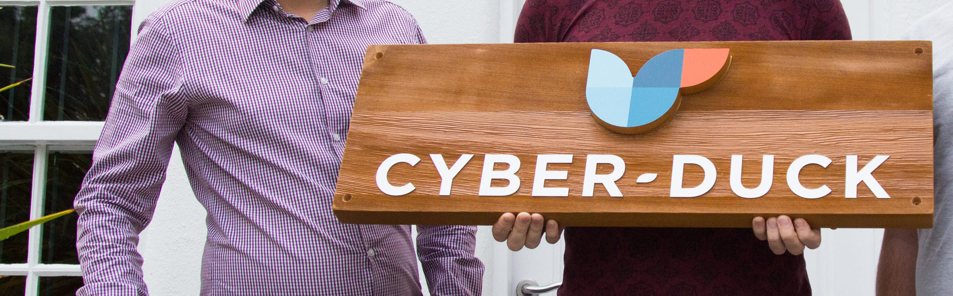
This is the most prominent declaration of our brand.
Cyber-Duck’s visual language ensures all imagery reflects our brand’s fresh philosophy and personality. Having a visual design system means we can communicate in a meaningful, compelling and accessible way.
Each visual element is distinct, defined and re-usable. This guide helps our team present Cyber-Duck consistently and professionally. Users enjoy dynamic, cohesive experiences!
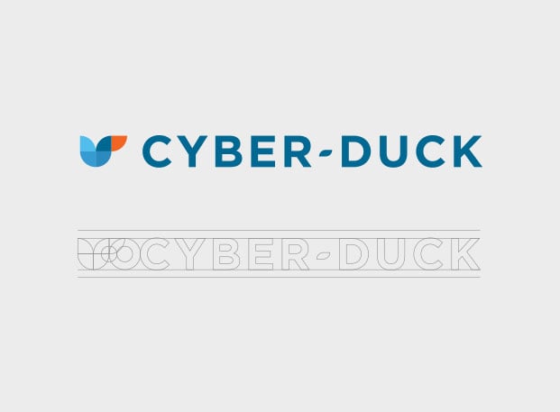
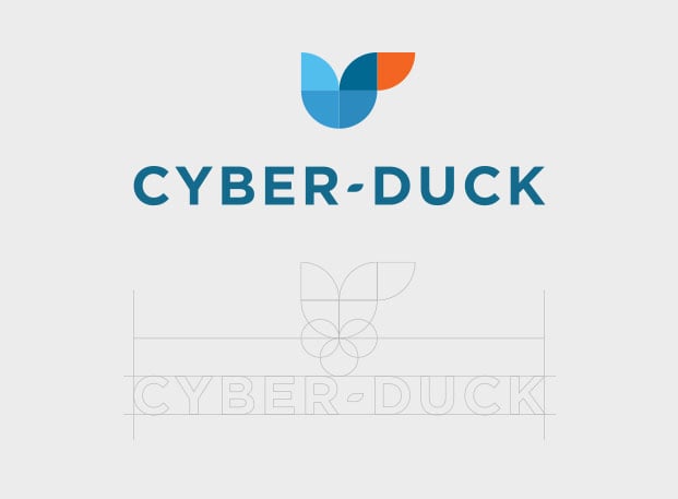
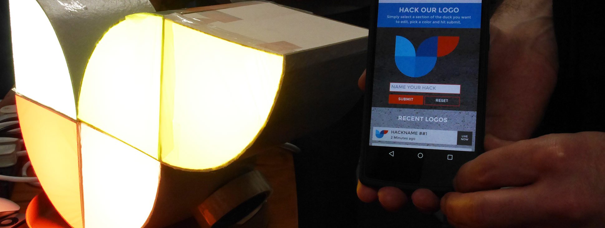
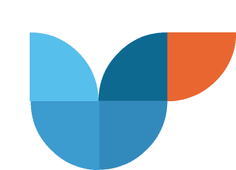
Of course, the abstract beak, head, body and wing of our majestic duck in flight are recognisable. Have you spotted that she occasionally flutters her wings?
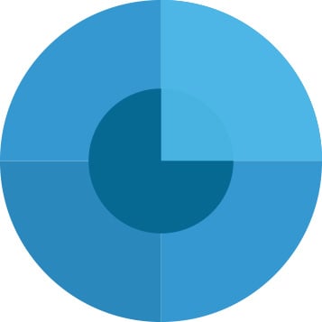
She’s built from five identical quadrant shapes. These are used to reflect our five core services: branding, user experience, development, marketing and support.
These quadrants are flexible and organic, ready for us to adapt throughout branded material. For example, our logotype’s hyphen combines two shapes.
But we haven’t forgotten our history. Our previous logo drew a duck from the letters ‘c’ and ‘d’. Both are still present here, in an abstract form.
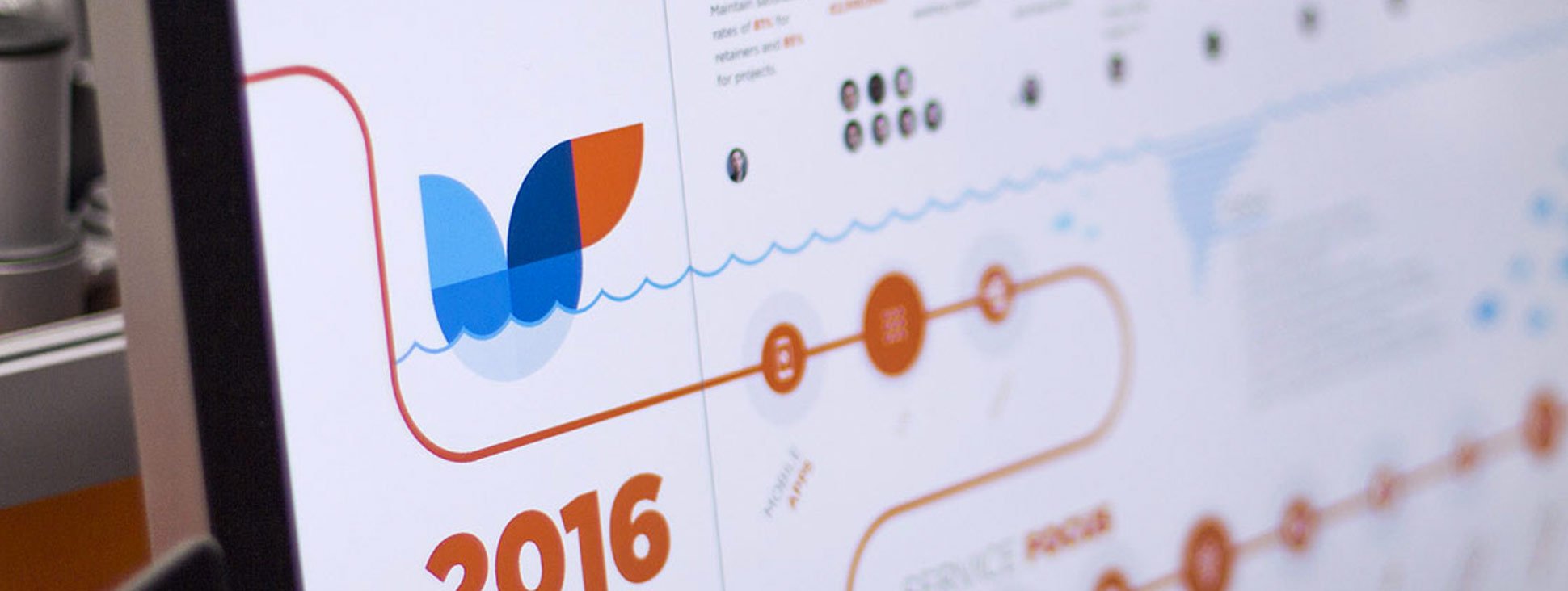
Find out about our 2015 rebrand
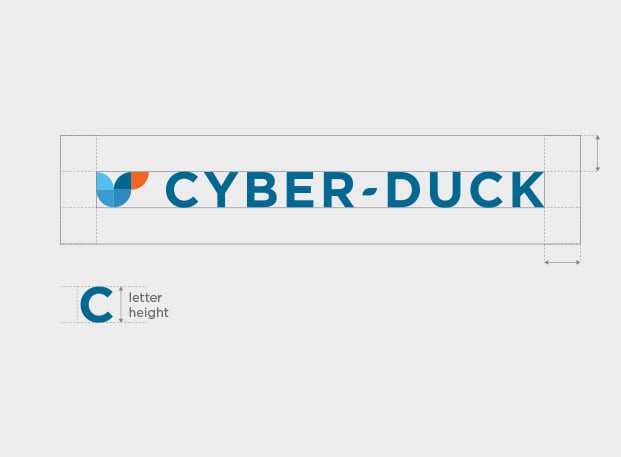
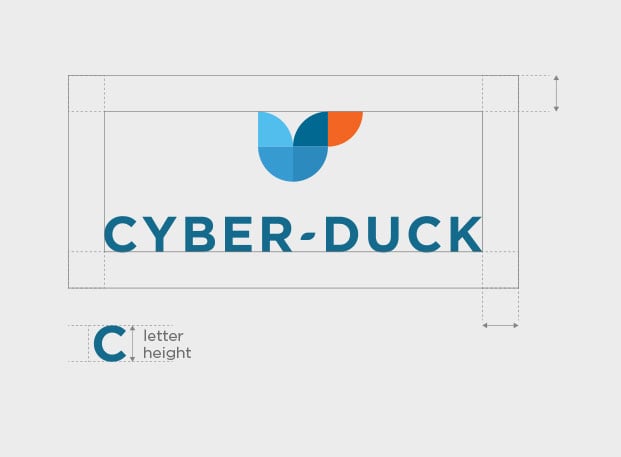
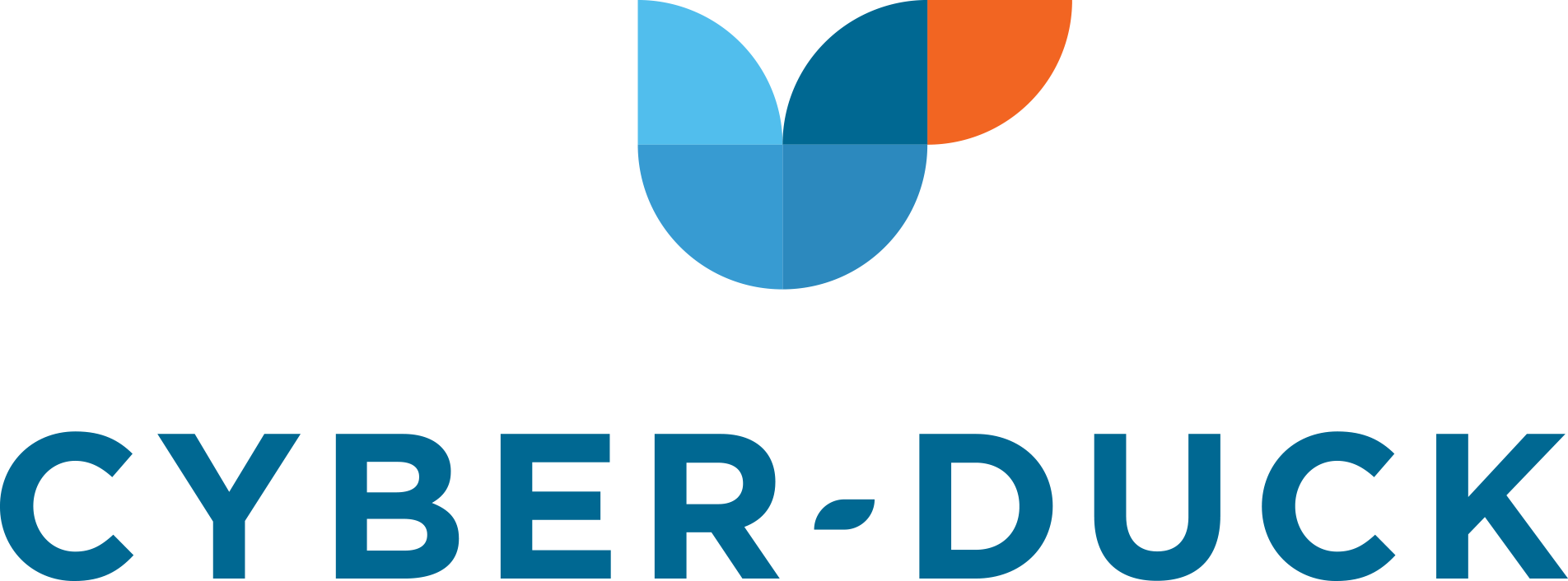
For maximum flexibility, we have two versions of our classic logo! This ensures our duck is presented nicely and visibly across different contexts and sizes.
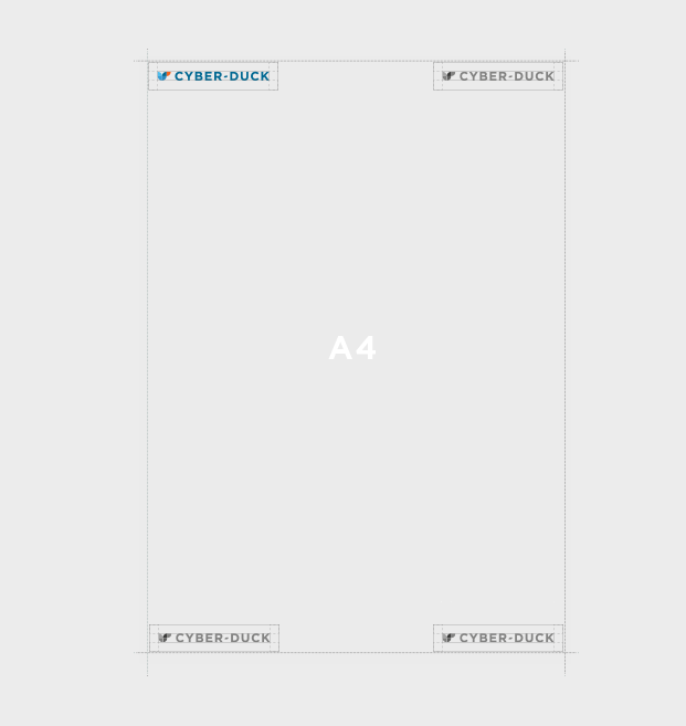
Please choose the logo that fits best and respect each one’s placement and positioning guidelines.
Only use our monogram with audiences that are familiar with Cyber-Duck, or where our name is already mentioned. Full colour where possible! If this clashes with the background, white-out or greyscale are available. The circles below are examples.


As you can see, our main colours are variants of a cool, calming blue and an energetic, youthful orange. These reflect our brand identity and sub-consciously communicate our enthusiasm and professionalism!
We chose a type system that is bold and modern with a personable edge.
It balances our brand’s professional, meticulous approach, alongside our eager enthusiasm for sharing fresh insights.
| Usage | Web & print | Fallback alternative | Usage |
|---|---|---|---|
| Primary Heading |

|

|
Please use for headings and primary messaging in all caps. Select the correct font variation (Bold). |
| Secondary Heading |

|

|
Please use for secondary heading and pull out quotes sparingly. Select the correct font variation (Italic). |
| Tertiary Heading |

|

|
Please use for tertiary headings and hero paragraphs. Select the correct font variation (Medium or Bold). |
| Body |

|

|
Please use for body copy and detailed text, using upper and lower case. Select the correct font variation (Book or Regular). |
Please use for headings and primary messaging in all caps. Select the correct font variation (Bold).
Please use for secondary heading and pull out quotes sparingly. Select the correct font variation (Italic).
Please use for tertiary headings and hero paragraphs. Select the correct font variation (Medium or Bold).
Please use for body copy and detailed text, using upper and lower case. Select the correct font variation (Book or Regular).
Icons are the bread and butter of Hollywood… and the web. These pictograms display key points and help users navigate. So it's important to use them correctly. Our Cyber-Duck icon set is comprehensive, sleek and easy to understand across platforms.
 Holistic
No doubt, it will become part of a set and join the website’s design style. So, how well does it fit?
 Accessible
Sizing and visibility are key. Users must be able to understand it, whether they’re looking on desktop, iPhone, TV… you name it.
 Audience
They are the people we're designing for. Without applying user-centred design thinking, designs could be a stab in the dark.
 KISS
KISS
That's keep it simple, stupid. Design class 101! The simpler, the easier to ‘read’ and understand.
 Branding
 User Experience
 Development
 Marketing
 Support
38 px
6 mm
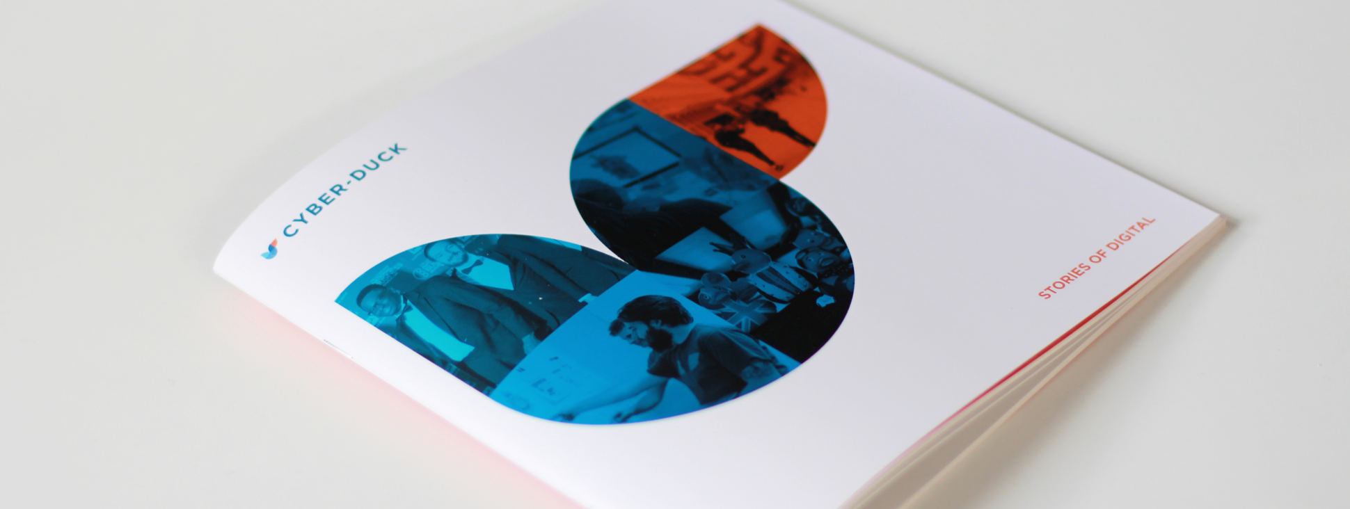
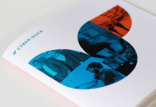
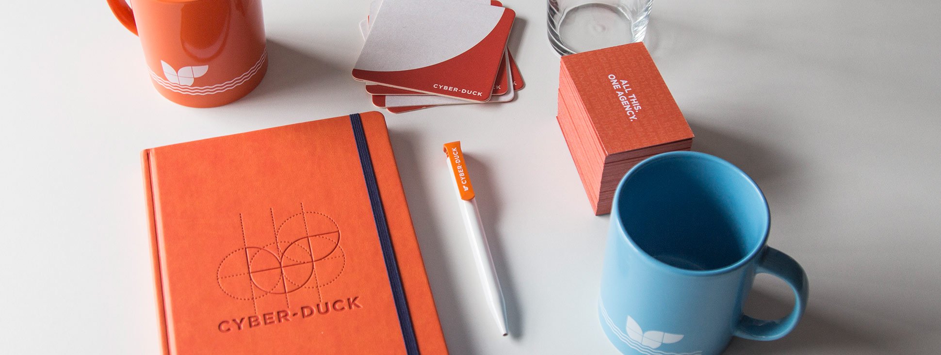
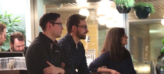
A solid graphic identity with great logos, colours and font, is all very well. But what about the physical world? Photography shows off our company culture and lovely human faces.

Just like our agency and employees… our photography is original. We take our photos in-house to create a unique, bespoke look.
All interactions with Cyber-Duck should be confident and authentic. For example, we avoid staging clichéd poses – instead, show the reality of our agency.
Camera phones need not apply. We ensure images are top quality and not rushed, tweaking carefully to look the very best they can.
We should shout about what we stand for! Our photos strive to portray our values, culture and fantastic standards for user-centred design.
Adhering to popular guidelines – in photography or any visual design – creates a pleasing, compelling quality. It boosts how we communicate our identity, insights and culture!
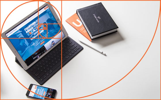
The Sistine Chapel. Snail shells. Pyramids. Spiral galaxies. What do they have in common? The golden ratio! Based on the principle of the ‘perfect number', this is the ratio of 1 to 1.618.
The Fibonnaci spiral is the most famous. Back in the 12th century, the mathematician scoured a number series that could produce a visually appealing composition.
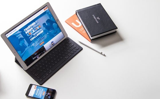
Visualise this spiral as a frame to compose photographs that lead users around the scene in a natural flow. For example, the image’s main focus would not be placed slap-bang in the middle, but feature in the corner-third.
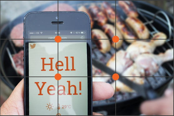
Rule of thirdsThis guideline is a touch simpler! Instead, divide photograph frames into thirds, both horizontally and vertically. The crossroads mark four compelling areas for images, where points of interest could be created.
Further elements could be placed on the vertical lines. We use this composition to create balanced images, using the ‘sweet spot’ where users are likely to focus.
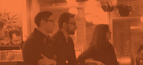
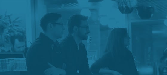
We use photography in its original form to pack our personality and products into blogs, case studies and more. But to reduce distraction (or add messaging), we brand them with a colour from our palette. Here's some examples.
Watch the step-by-step Adobe Photoshop guide to get started with creating our classic photography treatment for web and print-based jobs.
Visual aids can help push the right buttons, literally and metaphorically! Animation boosts great design. It not only helps guide a user visually, but adds energetic excitement that brings the content to life.
Sounds simple? Without some basic animation principles, it’s easy to make design look too busy. Let's lay the groundwork for these tricky little numbers.
 Natural
Motion is a lovely-looking thing, but it must feel natural and suit the design.
 Unobtrusive
Unless it’s alone, animation shouldn't detract attention from the main purpose of the design.
All users should easily understand the purpose of the animation. Otherwise, it adds nothing!
 Lightweight
Nobody wants to wait for an animation, however good it could look. Ensure the coding behind it can load quickly.
Now you understand how our entire visual communication system communicates Cyber-Duck’s identity. Check out further sections below.
 Home
Home
The story behind Cyber-Duck, sharing our mission, philosophy, personality and more
 Tone of Voice
How we express our personality and perspective feat. slogans, writing style and conventions
 Applying Our Brand
The best examples of our visual language and tone out in the wild feat. print and digital collateral
